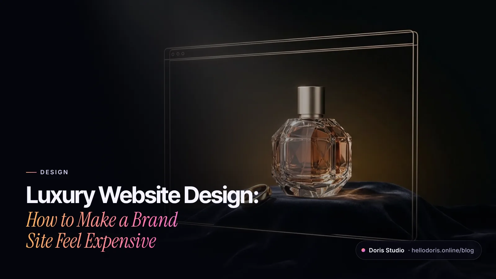
Luxury website design makes a brand’s site feel as considered as its products. In practice that means restraint (fewer elements, more space), confident typography, unhurried pacing, imagery or 3D that shows craft up close, and service that’s as easy online as it is in the boutique. A site feels expensive because of what you leave out, and because it’s fast and clear the moment someone is ready to buy, not because of gold gradients or more animation.
Key takeaways
- Restraint is the brand: one idea per screen, one accent color, generous space.
- Pair an expressive display face with a quiet text face, and keep it readable.
- Pace the story in chapters, but keep scrolls short and motion optional.
- Art-direct one hero object, photographed or in 3D, and show it up close.
- Sound only when the visitor asks for it.
- Put service on the page: appointments, private viewings, clear prices.
- Speed is part of the luxury, and so is a checkout people trust.
What makes a website feel luxury?
The same things that make a boutique feel luxury: space, light, material and service. Online, that translates into restraint, craft and help that arrives before you ask for it.
Restraint usually starts with minimalism, which Nielsen Norman Group describes as simplifying interfaces by removing elements and content that don’t support what users are trying to do (NN/g). The qualifier matters, because many luxury sites cut content their visitors need. In NN/g’s research on luxury shoppers, the “consider” phase, when people compare products, check details and look for prices, was the low point of the journey; brand sites let shoppers down with poor organization, few photos, confusing terms and missing details (NN/g). NN/g has also argued that the emotional, store-first focus of luxury brands often leaves their e-commerce behind (NN/g). A luxury site has to be beautiful and still answer every question.
| Cue | Feels expensive | Feels cheap or tiring |
|---|---|---|
| Space | One idea per screen, wide margins | Empty screens you have to scroll past |
| Type | One expressive display face, one quiet text face | Thin gray text that’s hard to read, too many fonts |
| Color | A limited palette with one accent for actions | Gold gradients and glows everywhere |
| Motion | Slow reveals that follow the scroll | Everything animates and nothing can be skipped |
| Imagery | One hero object, shown up close | Stock photos, carousels that advance on their own |
| 3D | A product or place you can’t photograph | Spinning logos and effects with no reason |
| Sound | Off until the visitor turns it on | Music that autoplays |
| Prices | Shown, or a gracious way to ask | Hidden, with no way to find out |
| Service | Book, reserve, talk to a person | A generic form and silence |
How do you make a website look expensive?
Three design decisions do most of the work: restraint, typography and pacing.
Restraint: fewer elements, more space
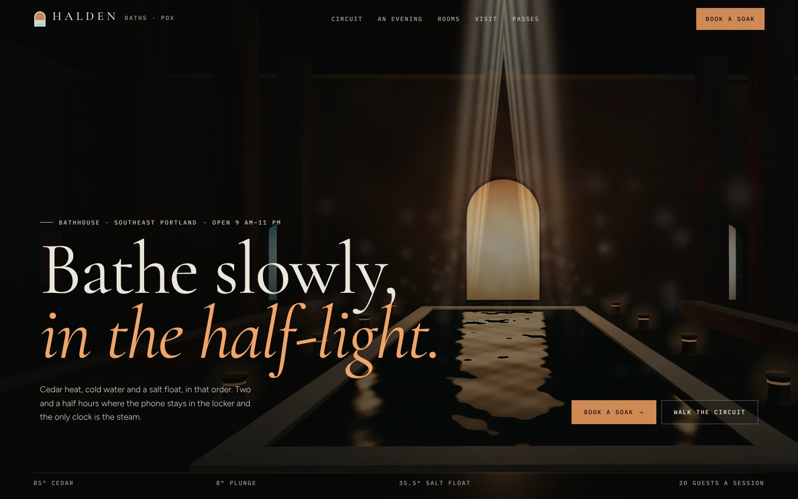
Give every screen one job. The hero of Maison Lune, a Lab concept for an invented Los Angeles skin salon, holds little more than a serif headline, one sentence, two buttons and a single iridescent 3D drop of serum. The palette is near-black and ivory, with a warm coral on the booking buttons. Halden Baths, a concept for an invented Portland bathhouse, keeps to dark wood tones and one copper accent, used for the italic half of its headline and its booking buttons.
Restraint has limits. NN/g’s warnings about minimalism apply directly: don’t hide navigation people need, don’t remove content that supports their task, and keep enough contrast to read (NN/g). Maison Lune’s navigation stays visible and short: Menu, Sérum Nº 1, Rituals, First visit, Lune Club, FAQ and a booking button.
Typography that carries the brand
Type does more for a luxury feel than any effect. The pattern that works is a pairing: an expressive display face for headlines and a quiet sans-serif for text, prices and buttons. From our Lab:
- Maison Lune: Bodoni Moda, a high-contrast serif, with Manrope.
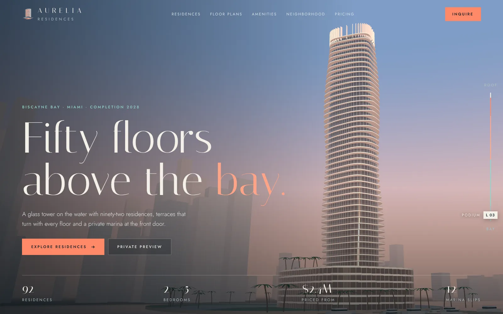
- Aurelia Residences: Italiana for headlines, Jost for text, and letter-spaced capitals for the navigation.
- Halden Baths: Cormorant Garamond with Figtree, plus IBM Plex Mono for small labels such as water temperatures.
Set headlines large and let them breathe, but don’t let elegance cost legibility. Thin, light-gray type on a dark background is the classic failure. WCAG asks for a contrast ratio of at least 4.5:1 for normal text and 3:1 for large text, meaning at least 18 point, or 14 point bold (W3C). Check your body text, captions and prices, not just headlines.
Pacing: chapters, not an endless scroll
Luxury moves slowly, but slow shouldn’t mean long. Each chapter has to earn its screen, and visitors should never scroll through emptiness waiting for the next thing to appear.
Halden Baths paces its story like the visit itself. “An evening at Halden” runs minute by minute, from arriving at 6:00 pm to the broth bar at 8:15. Then a “walk the route” chapter moves you through the cedar sauna, the cold plunge and the salt float as you scroll, with small interactions on the way: pour a ladle on the stones, practice a 30-second plunge breath, dim the float room’s light. Aurelia Residences keeps a floor indicator on the side of the screen, so you always know which level of the tower you’re looking at.
Make motion optional. The prefers-reduced-motion media query tells you when a visitor has asked their device to minimize motion (MDN); all three concepts here check it and switch off their reveal animations.
Photography, 3D and sound: art direction for luxury
Choose one hero object and show it closer than a store shelf would. Then decide, object by object, whether photography or 3D tells the truth better.
Use 3D for what a camera can’t capture
Aurelia Residences is a concept for an invented Miami tower that, in its story, won’t be finished until 2028, so there’s nothing to photograph; the tower is drawn live in the browser instead, with terraces that turn a fraction with every floor. Maison Lune’s serum is a single drop, and its 3D version changes tint with the treatment you point at: pearl for facials, espresso for brows, ink with an oil-slick sheen for lashes, honey amber for peels.
Use photography for texture, food and people
DORISÉ Patisserie, one of our own brands, opens on a cinematic hero of floating product cards built from its cake photography. Doris Coffee House, also our own, floats 3D coffee beans in front of photographs of its drinks and coffee bags, in a dark, editorial layout.
Whichever you use, keep one lighting mood and one color grade across the site, and answer the practical questions. NN/g’s participants wondered about size, material and styling, and wanted to see products from several angles (NN/g).
Sound: only when the visitor asks
Sound can make a brand site memorable, and it’s the quickest way to make one feel intrusive. Browsers have already decided for you: Chrome allows autoplay with sound only after the visitor has interacted with the site (or in a few other cases), and a Web Audio context created before that starts suspended (Chrome for Developers). WCAG adds that audio playing automatically for more than three seconds needs a way to pause or stop it, or a separate volume control (W3C).
So treat sound as an invitation. In Nightglass, our concept for an invented gaming keyboard, a “Sound off” toggle sits in the navigation, switch sounds are synthesized live in the browser, and nothing plays until the visitor presses a button. The same approach suits a perfume house, a hotel or a watchmaker.
Product storytelling that answers questions
Story chapters (origin, material, process, care) are where luxury sites shine, as long as each one carries facts. Maison Lune’s “One drop, four jobs” chapter tells the serum’s story, then lists the finish, a pH of 5.6, no added fragrance, the price and the refill price. A “hold to draw a drop” interaction counts to three and explains that three drops are enough.
Aurelia does the same for property. Each tier of residences shows bedrooms, interior square footage, number of homes and a starting price, and a pricing table lists availability per residence type alongside the deposit schedule.
On prices themselves: NN/g notes that some luxury brands leave prices off on purpose, as a barrier to entry (NN/g). If that’s your choice, make asking as elegant as the rest of the site: a named advisor, an appointment or a private-viewing request in the spot where the price would be.
Service touches: appointments, viewings, concierge
In a boutique, service is the luxury. Online, it looks like this:
- Appointments with choices. Maison Lune’s booking picks a treatment, day, time and aesthetician (first available, or a senior aesthetician for $20 more), and its FAQ explains the cancellation policy in two plain sentences.
- Private viewings. Aurelia’s preview request asks which residences interest you and your timing, and promises a residence advisor.
- Know-before-you-go. Halden explains what’s included, what a first visit looks like, its step-free access and its accessible float room, and passes can be gifted.
- Custom orders and delivery. DORISÉ offers custom-cake ordering in 48 hours and same-day city delivery; Doris Coffee House takes table bookings.
For made-to-order products, a configurator can be a service touch too; see our guide to 3D product configurators.
Luxury e-commerce: speed and trust
Speed is part of the luxury
A slow page feels cheap, whatever it looks like. In a study commissioned by Google and run by 55 and Deloitte across 37 brand sites and over 30 million sessions, a 0.1-second improvement in mobile speed metrics was associated with gains across verticals, and luxury saw the largest effect: progression from product page to add-to-basket rose 40.1% (web.dev). Treat that as direction rather than a forecast, but the direction is clear.
The fixes are rarely glamorous: headline and buttons in HTML that paint first, images sized for the screen and lazy-loaded below the fold, a couple of font weights instead of eight, and 3D that loads after the words. Our guide to fast 3D websites covers the 3D side.
Earn trust at checkout
Beautiful product pages don’t help if the checkout raises doubts. In Baymard Institute’s cart-abandonment research, once shoppers who were just browsing are set aside, 19% had abandoned a checkout because they didn’t trust the site with their card details, and 13% because the returns policy wasn’t satisfactory (Baymard). For a luxury order, show these before the cart, not after:
- Delivery dates, packaging and gift options
- Returns, exchanges and aftercare such as repairs or resizing
- Authenticity and materials
- Payment methods from providers people recognize
- A person to contact, by name if possible
Luxury website checklist
- One idea per screen, one accent color reserved for actions
- A display and text typeface pairing; body text meets 4.5:1 contrast
- Navigation visible and short; nothing users need is hidden
- Chapters that earn their screen; no long empty scrolls
- Reduced-motion settings respected
- One hero object, art-directed, shown up close and from several angles
- Sound off by default behind a clear toggle
- Facts in every story chapter: size, materials, care, price
- Appointment, private-viewing or concierge options on product pages
- Headline paints first; images and 3D load without blocking it
- Delivery, returns and payment shown before checkout
Build a site that feels like your store
Our luxury brand and e-commerce websites service covers art direction, 3D product stories and the ordering, booking and private-viewing flows behind them. Modern 2D redesign packages start at $500, with a 50% deposit and the rest at launch; cinematic and 3D brand sites are quoted after a short call. Tell us about your brand, and we’ll show you a free concept first.
Frequently asked questions
What makes a website look luxury?
Restraint, craft and service. Fewer elements with more space around them, an expressive display typeface paired with a quiet text face, a limited palette, imagery or 3D that shows the product up close, and booking, viewing or concierge options that make the site feel staffed. Speed matters too: a slow page undoes the effect.
How much does a luxury website cost?
It depends on the scope: the number of products, custom photography or 3D, e-commerce and booking flows, languages and integrations. At our studio, modern 2D redesign packages start at $500, and cinematic or 3D brand sites are quoted after a short call. You see a free concept before you commit.
Should a luxury brand show prices on its website?
Usually, yes, or at least give a clear and gracious way to ask. Nielsen Norman Group found luxury shoppers do much of their research online and that brand sites often fail them during that comparison stage. If you choose price on request, put a named contact, an appointment option or a private-viewing request right where the price would be.
What fonts do luxury brands use on their websites?
Most pair a high-contrast or refined serif for headlines with a simple sans-serif for body text and buttons. Our Lab concepts use pairings such as Bodoni Moda with Manrope and Italiana with Jost. Whatever you choose, keep body text large and dark enough to meet WCAG's 4.5:1 contrast minimum.
Should a luxury website play music or background video?
Not automatically. Browsers block autoplay with sound until the visitor interacts, and WCAG requires a way to pause or stop audio that plays automatically for more than three seconds. Offer sound behind a clearly labeled toggle that starts off, and keep any background video muted, short and optional.
Can a luxury website also be an online store?
Yes. The craft is keeping the brand mood through product pages and checkout while making delivery dates, returns, packaging and payment options easy to find. Many luxury brands also add appointments, private viewings or made-to-order requests alongside the cart.
Sources
- The Characteristics of Minimalism in Web Design (Nielsen Norman Group)
- Luxury Shopping User Groups and Journeys (Nielsen Norman Group)
- Why So Many Luxury Brands Are Terrible at Ecommerce (Nielsen Norman Group)
- Understanding Success Criterion 1.4.3: Contrast (Minimum) (W3C)
- Understanding Success Criterion 1.4.2: Audio Control (W3C)
- Autoplay policy in Chrome (Chrome for Developers)
- prefers-reduced-motion (MDN)
- Milliseconds make millions (web.dev)
- Cart Abandonment Rate Statistics (Baymard Institute)

Founder and creative director of Doris Studio. Doris designs and builds immersive 3D websites, brand sites, browser games and learning worlds for clients in the US and worldwide, and leads creative at SentryX. About Doris · See the Lab